Chapter 5 Probing (Statistical) Relationships with Correlation Analysis
This week, we are going to explore relationships between continuous variables, using correlation. We will take a look at how to combine composite variables into a single score, as this is something we often do in the pusuit of understanding the human psyche. We will also visualise relationships between variables using scatterplots, and conduct Pearson correlation analyses in R.
5.1 Checking installation and loading packages
As usual we first always check and load in our required packages. This week, as usual, we will need the packages here and tidyverse.
5.1.1 Activity - write the code to load packages from the library
Today, we are not giving you the code to copy and paste. You are ready to fly, and write it yourself now you have mastery of the codeship. You are welcome to decide yourself whether you would like to check if the packages are installed before you load them.
Go to your script for the week ‘05_Correlation-analysis.R’ and add the code to load the packages
hereandtidyverseusing thelibrary()function. Write the code to check if the packages are installed if you wish. Make sure to run the code.
5.2 Investigating correlational relationships
We have previously looked at how mood and location influence social media use. Now we’re going to look at the relationship between social media use, age and political activism. It has previously been shown that social media use has a positive relationship with levels of political activism in other countries such as Jordan (Alodat et al, 2023). However, we don’t know if this is true for young adults in Australia. This is what we will test today.
Today we will be using the time_on_social, age, polit_informed, polit_campaign and polit_activism variables.
The details of these variables are in the README.txt file, so you will already know what these variables stand for. However, let’s recap - these variables stand for the following:
age – age in years
time_on_social – average hours/day on social media (self-report diary)
Political attitude subscales:
polit_informed – how politically informed they feel (e.g., read news daily)
polit_campaign – how much they engage in campaign-related discussion
polit_activism – involvement in activism (e.g., protests, petitions)
polit_informed, polit_campaign and polit_activism are subscales of a political attitudes questionnaire. Each subscale is scored out of 7, with higher scores indicating greater political attitude in that domain.
5.2.1 Activity - Get the data
We will need to calculate our own political attitudes score, but first we need to load the data.
Load the
PSYC2001_social-media-data-cleaned.csvdataset into a data frame calledsocial_media.
HINT: If you are stuck, you can copy and paste this code from a previous week.
Run the code and check that the data is loaded correctly using your preferred method from Section 2.6.1.
5.3 Building a composite score that measures political attitude
Let’s now get an idea of our much political attitude these participants have. We have scores from 3 subscales of a political-attitudes questionnaire. We need to combine them into a single ‘political attitude’ score for each participant. Each subscale score carries a different weighting towards the total political attitude score.
Weighting refers to the amount (proportion) that each subscale contributes to the single overall political attitude score, e.g. if a subscale has a weighting of 0.25, then it contributes one quarter (25%) of the total score.
Pause for thought: Why would each subscale carry a different weighting? Think about what was discussed in the lectures about composite scores.
5.3.1 Activity - Get some political attitude
The formula for calculating political attitude is:
\[\mathrm{PoliticalAttitude} = 0.25 \times \mathrm{polit\_informed} + 0.35 \times \mathrm{polit\_campaign} + 0.4 \times \mathrm{polit\_activism}\] Now you have this formula, let’s build the code that creates the political attitude scores step by step, and test that its working properly.
The first operation we need to do is to multiply each observation in the polit_informed column by 0.25.
Examine the data frame using the View() function (or using another method if you prefer). Take the first 3 observations from
polit_informedand multiply each of them by 0.25 (in the console, on a calculator, or in your head). What are the 3 results that you get? Write them as a comment in your script.
Now we know what answers we should get, we can write some code to multiply these observations by 0.25, and check the code works.
Remember, if we want to create a new variable in a data frame, then mutate() is a very handy function to use.
Here is the code from Section 4.3.1 that gives a good example on how to use the mutate() function. This code is also in your script for this computing lab.
Amend the below code in your script, so that you save the data frame to an object called
social_media_test
social_media_likes <- social_media %>%
  mutate(likes =(bad_mood_likes + good_mood_likes)/2 ) # creates a new variable called likes which is the average of bad_mood_likes and good_mood_likes
Now amend the code so that you make a new column called
test(instead oflikes) that takes the columnpolit_informedand multiplies each entry by 0.25.
Hint: You multiply in R using the * symbol.
Run your new code and then run
View(social_media_test)to check the results. Compare the first 3 values of the variabletestto the results you got from your manual calculation.
The next thing we need to do is multiply polit_campaign by 0.35, and add it to the previous result.
Using the console (or your mind brain), calculate yourself what values you should get if you take the first few values of
polit_campaignand multiply each of them by 0.35. Then add these new values to those you got when multiplyingpolit_informedvalues by 0.25. Write these new results down as a comment in your script.
Now lets amend our code so that it can calculate these new values.
Using the code you just wrote, add
+ 0.35 * polit_campaignto inside yourmutate()function call. Run your new code. Check the contents of thetestvariable to make sure the first few numbers match your own calculations.
Nice work! We tested each bit of the code and we now know that we are on the right path to calculating the composite scores for political attitude.
We created the data frame social_media_test as a kind of scratch pad for testing. But we don’t need the results of those tests to complete our analysis. So let`s remove it from our environment, in a bid to keep the environment tidy.
Run the following line of code to remove the
social_media_testdata frame from your environment
Now lets properly create the political attitude scores, and save the resulting data frame to an object that has a useful name for our analysis.
Complete the following line of code in your script
Check the contents of the new data frame using your favourite method to check the new variable has been added
See Section 2.6.1 if you want some inspiration on methods.
##   X id  age time_on_social urban good_mood_likes bad_mood_likes
## 1 1 S1 15.2           3.06     1            22.8           46.5
## 2 2 S2 16.0           2.18     1            46.0           48.3
## 3 3 S3 16.8           1.92     1            50.8           46.1
## 4 4 S4 15.6           2.61     1            29.9           29.2
## 5 5 S5 17.1           3.24     1            37.1           52.4
## 6 6 S6 15.7           2.44     1            26.9           20.2
##   followers polit_informed polit_campaign polit_activism
## 1     173.3            2.3            3.2            3.6
## 2     144.3            1.6            2.2            2.6
## 3      76.5            1.9            2.7            3.0
## 4     171.7            1.6            2.3            2.6
## 5     109.5            2.0            2.9            3.3
## 6     157.5            2.4            3.4            3.9
##   polit_attitude
## 1          3.135
## 2          2.210
## 3          2.620
## 4          2.245
## 5          2.835
## 6          3.350
5.3.2 Activity - save the results of your hard work
It is going to be useful for us to save the data frame that contains this new variable, as we will be using it again in the next computing tutorial. So let’s save the data frame as a ‘.csv’ file.
Our social_media_attitude data frame has a lot of variables that we don’t need for this analysis, or the analysis we will run next week. So let’s tidy up the data a bit. We’ll reduce our data frame so that it only contains the columns: id, time_on_social, polit_attitude, age, and urban.
For that, we can use the select() function, as we did in Section 4.3.1. Here is the relevant code from that section again:
social_media_likes <- social_media %>%
  mutate(likes =(bad_mood_likes + good_mood_likes)/2 ) %>% # creates a new variable called likes which is the average of bad_mood_likes and good_mood_likes
  select(id, urban, likes, followers) #selects only the specified columns from the data frame
The key piece of code we need to add to our code and adapt so that we select only the relevant variables we want to keep (which are id, time_on_social,polit_attitude,age, and urban) is the following:
%>% select(id, urban, likes, followers)
Copy and paste the key piece of code to the relevant place in your script, and amend it so that you instead select the variables
id,time_on_social,polit_attitude,age, andurban. Run your code to get your refined data frame. Check the resulting data frame looks as you would expect using your preferred method.
You should get a data frame whose contents look like the below:
##   id time_on_social polit_attitude  age urban
## 1 S1           3.06          3.135 15.2     1
## 2 S2           2.18          2.210 16.0     1
## 3 S3           1.92          2.620 16.8     1
## 4 S4           2.61          2.245 15.6     1
## 5 S5           3.24          2.835 17.1     1
## 6 S6           2.44          3.350 15.7     1
Now we are ready to save our refined data frame to a ‘.csv’ file for future use. If you remember, we did something very similar in Section 2.10.1, using the following code below, which you will also find in your script.
Amend the code below to save the
social_media_attitudedata frame to a file called “PSYC2001_social-media-attitude.csv” in the “Data” folder. Run your code and check the Data folder now contains the new file.
write.csv(social_media_NA, here("Output","PSYC2001_social-media-data-cleaned.csv")) #creates a csv file from the dataframe social_media_NANote that we previously saved the ‘.csv’ file to the “Output” folder, and this time we are saving to the “Data” folder. It can be a good idea to be careful about what you save to the Data folder when you first start out coding, because you want to make very, very sure you don’t overwrite the original data. But now we have grown and learned and we feel more confident saving something straight to the “Data” folder without incurring disaster.
5.5 Looking for lines
Now let`s visualise our data!
We’re going to explore the relationships between our variables to see if it is appropriate to run a Pearson correlation analysis. Remember, we use a Pearson correlation analysis when we think a straight line is a reasonable approximation of the relationship between our variables.

Figure 5.1: MFW people don’t visualise their data
5.5.1 Activity - Scatterplots to visualise relationships (in the hunt for straight-ish lines)
Let’s use ggplot to make scatterplots to show the relationships between time_on_social, polit_attitude, and age. You can see a little bit about scatterplots and how to implement them in R here.
We have given you the code for the first scatterplot.
Run the code to make this scatterplot of the relationship between
polit_attitudeandtime_on_social.
You should see a scatterplot that looks like the one below.
social_media_attitude %>%
  ggplot(aes(x = polit_attitude, y = time_on_social)) + # set up the canvas
  geom_point(colour = "orange") + # make a scatterplot
  labs(x = "Political Attitude", y = "Time on Social") + # define labels
  theme_classic() # make pretty
## Warning: Removed 2 rows containing missing values or values outside the scale
## range (`geom_point()`).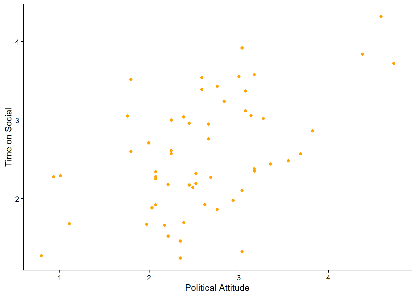
Note: we get a warning message. The message is telling us that there are 2 rows containing missing values. That’s ok. We know this, because we turned the -999s in the time_on_social variable into NAs in Section 2.9.1. We also learned then that there were 2 participants with missing data for time_on_social. So we can safely ignore this warning message. It is always a good idea to check, when getting a warning message, that you understand what is causing it.
What do you think? Would you say there is a linear relationship between political attitude and time spent on social media?
Imagine drawing a straight line through the cloud of dots. Is there a straight line you can draw that the data points are consistently clustered around? (i.e. there is roughly the same number of data points above and below the line at every point along the x-axis).
Now, using the above code as a guide, create two more scatterplots: one of the relationship between
polit_attitudeandage, and another oftime_on_socialandage.
You know you will have completed your mission when you have produced plots that look something like the following:
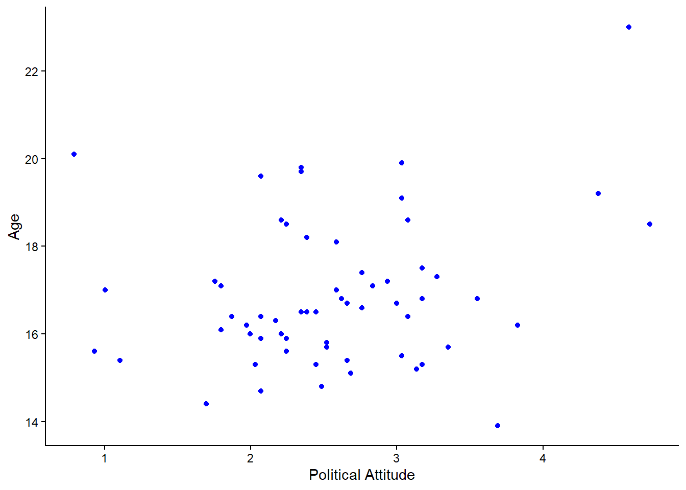
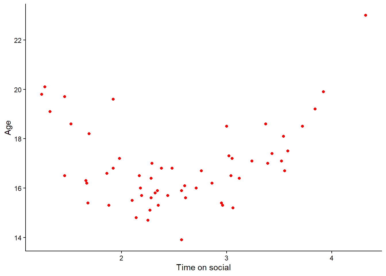
Remember to check you have adjusted the axis labels!
Question: Take a look at the relationships depicted in these latter two scatterplots? Hint: one of them shows a non-linear relationship. Which one is it?
A non-linear relationship is present when the relationship between two variables does not appears to roughly follow a straight line. One example is when there is a curve shape. Remember that we do not want to conduct a Pearson’s correlation analysis when the relationship is non-linear.
5.6 Conducting correlations
First, let’s calculate the correlation coefficient between the variables that appear to share a linear relationship. Let’s start with time_on_social and polit_attitude. If you remember from your lecture, the correlation coefficient is a number that tells us the strength and direction of the linear relationship between two variables.
5.6.1 Calculate the correlation coefficient
Instead of calculating the correlation coefficient by hand, we can use a handy function called cor to do it for us. Even more handy, cor can be used in a pipe. So calculation the correlation coefficient between time_on_social and polit_attitude is as simple as:
social_media_attitude %>%
  summarise(r = cor(time_on_social, polit_attitude, use = "complete.obs")) #use = "complete.obs" removes all NA values from the correlation.
## r
## 1 0.5125282This tells us that there is a positive linear relationship between time spent on social media and political attitude, with a correlation coefficient of approximately 0.51. This suggests that as time spent on social media increases, political attitude also tends to increase. Given that correlation co-efficients range from -1 to +1, a value of 0.51 indicates a moderate positive correlation.
5.7 Testing the statistical significance of the correlation coefficient
However, we don’t stop once we have calculated the correlation coefficient (\(r\)). We need to know if this value of \(r\) is larger than we would expect to get by chance. Enter our hypothesis test for \(\mathrm{H_o}\)!
5.7.1 Activity - correlation using the formula method
We can use the cor.test() function to test \(\mathrm{H_o}\). We can use the cor.test() function either using the formula method, or using base R. We’ll do both, so that your coding journey is imbued with liberty.
The cor.test() function can take in a formula where the right hand side specifies the two numeric variables to be correlated with each other.
Note that this is a little different to when we used the formula method in Section 4.6.1, where our formula followed the syntax of DV ~ group. Specifically, we had a dependent variable on the left hand side, and a grouping variable on the right hand side. Thus, this formula says that we want to know how the DV changes as a function of group.
With a correlation analysis, we instead have two observed variables (i.e. we did not manipulate anything but just observed time spent on social media and political attitudes as they occurred in the wild), and we want to know what the correlation value is, as a function of those two variables.
So, this time, we have not bothered defining a DV on the left hand side. This is because we are saying we want to know the correlation as a function of our two numeric variables (time_on_social and polit_attitude). And because we are passing the formula into the correlation function, R knows what we are asking for, and so we don’t need to define a DV.
Knowing when you do and do not need to put a DV on the left hand side of a formula is something that comes with practice.
Run the following code in your script to run a correlation test on the relationship between
time_on_socialandpolit_attitude.
cor.test(formula = ~ time_on_social + polit_attitude, data = social_media_attitude, use = "complete.obs") #formula contains both numeric variables on the right hand side.##
## Pearson's product-moment correlation
##
## data: time_on_social and polit_attitude
## t = 4.4667, df = 56, p-value = 3.904e-05
## alternative hypothesis: true correlation is not equal to 0
## 95 percent confidence interval:
## 0.2930241 0.6807091
## sample estimates:
## cor
## 0.5125282Question: Have a look at the output in the console. What is the relationship between time_on_social and polit_attitude? Can you reject the null hypothesis? Was your hypothesis supported? What does the ‘df’ value tell you about the sample size? Why is it that number?
Add your answers to the questions above as a comment to your code.
5.7.2 Activity - correlation using base R syntax
The cor.test() function not only accepts formulas, but also base R syntax. In base R syntax, we specify the two variables to be correlated using the x= and y= arguments.
To specify the x= and y= arguments, we will need to use the $ operator as we did in Section 3.7.1.
Complete the following code in your script and run it to check you get the same output as when you ran a correlation test using the formula method.
Use the code from Section 3.7.1 as a guide, if you need.
Which method should I use? It will largely come down to your preference. You might prefer to think about the correlation in terms of your x variable and your y variable, or the formula may make more sense to you. The great thing about coding is that you can use the solution that suits you best.
5.8 Writing up results and conclusions
Now lets have a go at writing up the results of the correlation that we have conducted:
Results: A pearson correlation was performed to evaluate the relationship between political attitude and time spent on social media. It was found that there was a strong positive correlation between political attitude and time spent on social media (\(r\)(56) = .51, \(p\) < .01).
5.8.1 Activity - Correlation for the other pair of variables
Now, run the correlation analysis for the other pair of variables that shared a linear relationship. I know we haven’t told you which one it is, so make a guess and ask your tutor if you are not sure.
Copy and paste the code you wrote earlier for the correlation analysis into your script, from first using the
cor()function, up to performing the statistical test of \(\mathrm{H_o}\). Amend the code so that it runs a correlation analysis on the other pair of variables that shared a linear relationship. Run your code and interpret the results.
5.9 You are Free!
Well done folks, you have survived another computing tutorial! Next lesson we will be conducting linear regression on this data, so well done you for saving your data set.

Figure 5.2: This is you now
5.10 ⭐ Bonus exercises
5.10.1 Bonus Activity - A closer look at subscales
We created a composite score for political attitude by combining 3 subscales. But what do we know about each of the subscales?
Can you take the
social_media_attitudedata frame and plot the data for each of the 3 subscales:polit_informed,polit_campaignandpolit_activism?
There is always inspiration available at the R Graph Gallery.
5.10.2 Bonus Activity - Urban vs Rural Correlations
Would you expect the correlation between political attitude and time spent on social media to be the same for urban and rural participants? We can answer that!
Can you take the
social_media_attitudeuse thegroup_by()andsummarise()functions to build a set of pipes where you take thesocial_media_attitudedata frame, and the result is separate correlation coefficient values (\(r\)) between thetime_on_socialandpolit_attitudevariables for Urban and Rural participants?
Check how you previously used the summarise() and group_by() functions for clues!
5.10.3 Bonus Activity - Correlation Matrix
Sometimes it`s helpful to see all the correlation coefficients for all the variables that you are interested in at once.
Can you use the
select()andcor()function to create a pipe that takes thesocial_media_attitudedata frame, and that produces a correlation matrix that shows the correlations between all the variables you are interested in?
Important info make sure to only pick continuous variables, if not you will likely wind up down a garden path of nefarious errors.
This might be a tricky one. You could ask your favourite LLM for help, and then test and comment on the answer.
Do the correlation values match what you would expect? What else do you notice about the correlation matrix?