Chapter 3 Testing our first hypothesis
Today we are going to ask our first question and seek an answer from the data. We will get the data into shape so that it is in the right format for visualizing and analysing. Then we will run the analysis and learn the answer to our question. Welcome. You are now a research psychologist :)
3.1 Checking installation and loading packages
As usual we first always check and load in our required packages.
3.1.1 Activity - Load packages using the library() function
Your script contains the code to install the packages, if required. However, the bit that contains the code to load the packages using the library() function is missing.
Add the 2 extra lines of code to your script, and then make sure everything runs just fine.
3.2 Developing our hypotheses
Today we are going to address one of the key questions of the study about social media use – how does mood influence active social media use? Active social media use involves interacting with content (i.e. liking posts) rather than just observing posts.
There is some evidence to suggest that passive social media use is associated with lower mood in adolescents, whereas active social media use is related to positive mood Dienlin & Johannes, 2020. However, a lot of the existing evidence comes from self-report, rather than measuring social media behaviour directly.
To address this question, the researchers used the participants’ metadata to count how frequently they liked posts. By cross-referencing this with the mood diary kept by each participant, the researchers were able to calculate the average number of likes per 10 minutes of use when participants were in a good mood, and when they were in a bad mood.
Hopefully it’s clear by now that we will be addressing this question using the good_mood_likes and bad_mood_likes variables. Remember, these variables stand for the following:
good_mood_likes – average number of likes made over 10 min during a good mood (from platform + diary)
bad_mood_likes – as above, but during bad mood
But you should know this, because you read the README.txt file already, right? :)
3.2.1 Activity - Defining our hypotheses
Based on the information above, discuss and formulate hypotheses around the following, and add them as comments to your code.
- Should there be a difference in the number of likes between the mood conditions?
- What direction do you think this difference could be? Can you formulate an experimental hypothesis each way – i.e. good mood likes > bad mood likes, and vice versa?
- What is the null hypothesis?
Question: Discuss this with your neighbour and your tutor. Make sure you have clearly defined your hypotheses as a comment in your code before moving forward.
3.3 Loading our data ready for visualisation and analysis
When performing an analysis for an assignment, thesis, or publication, you will typically always follow the same basic steps. You will:
- Load the data.
- Visualise the distributions to check the data look ok (not ok data has strange outliers, strange values, or strange distributions).
- Get descriptive statistics and check they make sense.
- Perform the inferential test.
- Create a figure that provides a visual summary of the key statistical result.
Although you will always perform steps 1 through 5, you will typically only report steps 3, 4 and 5 in your write-ups.
So let’s get started.
3.3.1 Activity - Loading in the data
Last lab we were very smart and saved the cleaned version of the data as a new CSV file. This is what we will be using today. We put it in the Data folder for you already.
Use the Files pane to check the cleaned dataset is in the
Datafolder. Remember to click the two dots next to the green arrow to get back to the top-level folder.
First step! Let’s load the dataset PSYC2001_social-media-data-cleaned.csv. To do this we use the same read.csv() function combined with here(). Do you remember how to do this?
Complete the following line of code in your script. Again, we have been cheeky and have left a little bit out. But you should be able to work it out.
You can also refer back to Section 2.5.1 if you need to.
social_media <- read.csv(file = here(???,"PSYC2001_social-media-data-cleaned.csv")) #reads in CSV filesNow, we did save the data ourselves last week, so we know it is clean.
To be sure, add a line of code to your script so you can get a summary of the data using the
summary()function. You can check that the -999s are no longer there.
If you don’t remember how to do this, then you can check what happened in Section 2.6.1.
3.4 Visualising is important
We may have mentioned before that it’s incredibly important to visualise your data before running any statistical tests. This is because visualising your data can help you understand the underlying distribution of the data, identify any potential outliers or anomalies, and ensure that the assumptions of the statistical test you plan to use are met. Remember, it protects against “garbage in, garbage out”!
Warning: It is generally bad practice to go straight from the raw data to the results of a statistical test without first visualising the data.

Figure 3.1: Professors’ reaction when you don’t visualise data
3.4.0.1 Density plots are useful (and pretty)
One great way to look at the distribution of your variables is by using a density plot. A density plot is a smoothed version of a histogram which allows us to understand what the full distribution might look like if we had all the data in the world. More information on that is here if you are interested.
In order to make plotting easy we first have to wrangle our data a bit. Remember, data analysis is 90% wrangling, 10% analysis!
Our data is in something called wideform format. When data is in wideform, it means that each participant has their own row, and each variable has a column. Visually, this is more digestible for us mere humans.
Wideform data
##   id good_mood_likes bad_mood_likes
## 1 S1            22.8           46.5
## 2 S2            46.0           48.3
## 3 S3            50.8           46.1
## 4 S4            29.9           29.2
## 5 S5            37.1           52.4
## 6 S6            26.9           20.2
However, many functions in R, particularly those from the tidyverse package, require data to be in longform. (Fun fact: longform data is also referred to as ‘tidy’ or ‘narrow’ data, hence the tidyverse). In longform data, each variable has its own column, but each row represents a single observation. Because we have two observations from each participant (good_mood_likes and bad_mood_likes), then each participant takes up two rows of the longform data frame. So the longform version of our data looks like this:
Longform data
## # A tibble: 6 × 3
##   id    mood            likes
##   <chr> <chr>           <dbl>
## 1 S1    good_mood_likes  22.8
## 2 S1    bad_mood_likes   46.5
## 3 S2    good_mood_likes  46
## 4 S2    bad_mood_likes   48.3
## 5 S3    good_mood_likes  50.8
## 6 S3    bad_mood_likes   46.1
See how the values from row 1 of the wideform data (22.8 and 46.5) are now on the first and second row of the longform data, in the likes column.
As you can see, instead of having each subject’s good and bad mood likes in separate columns, we now have a single column for likes and a second column which indicates whether the likes were made in a good or bad mood. So each subject now has two rows in the dataset. This makes it much easier to plot, and to do many other things!
Helpful fact You may notice that the printout of the longform data has a few extra details, compared to the wideform data. The longform data is called ‘A tibble’ which is a special type of data frame that comes from the tidyverse package. It basically means that you used the tidyverse to make a new data frame, and the tidyverse package turned it into a tibble for you. Tibbles have a few extra features that make them easier to work with, but they are still data frames at their core. We’ll be calling them data frames throughout this course.
3.4.1 Activity - Get back on the pipes!
Its time to get back on the pipes! The code we use to get our data into longform takes the following steps:
- First we use the
select()function to easily choose which columns we do (or don’t) want to keep in our dataframe. Here we keep only the columns “id”, “good_mood_likes” and “bad_mood_likes”.
Run the following code in your script so you can see what the select function does. Note that we are not saving this as a new object, so it will just print to the console.
social_media %>%
  select("id","good_mood_likes","bad_mood_likes") # choose which columns we want keep in our dataframe
Handy hint: this is a great way to check what each function does!
Try adding one more column from the dataframe to the
select()function. For example, try adding theagecolumn.
Doing simple tests like this is a great way to check a function is really, really doing what you think.
Once you’ve done that, remove the extra column you added so that your code matches the code above.
- Now that we have the columns we want to work with, we use the
pivot_longer()function. This function will do all the heavy lifting turning our data from wideform to longform. Phew!
This is how the using the pivot_longer function looks.
social_media %>%
  select("id","good_mood_likes","bad_mood_likes") %>% # choose columns
  pivot_longer(cols = ends_with("likes"), names_to = "mood", values_to = "likes") #take columns ending with "likes" and move the column names into "mood" and column values into "likes"
The pivot_longer() function takes three important arguments.
- The
colsargument tells R which columns contain the key variables that we need to turn into longform. Here we use theends_with()function to tell R to take all columns which end with “likes”, nifty! Note that we didn’t necessarily need to use theends_with()function. We just did it because it’s handy. We could have usedcols = c("good_mood_likes", "bad_mood_likes")instead, which would have done the same thing. - The
names_toargument tells R what to call the new column which will contain the names of the columns we will be pivoting (i.e good or bad mood). Here we call this new column “mood”, as this is a good title for a column that will list whether the data were recorded when someone was either in a “good mood” or a “bad mood”.
- The
values_toargument tells R what to call the new column which will contain the values from the columns we are pivoting (i.e the rate of likes). Here we call this new column “likes”, because, erm, it contains the rate of likes.
Highlight and run this code in your script to see the work of
pivot_longer()!
Remember Running code bit by bit to see what results you get is absolutely the best way to learn and understand what code is doing. Now that you have seen what select() and pivot_longer() actually do, you are perfectly placed to put them together and assign the results to a new object, so that you can use the results of your deft wrangling for other purposes.
Now, very important, assign the ouput of your nifty coding work to a new object so that you can do impressive things to the results, like making density plots!
Amend the above code in your script so that your data frame is saved to an object called
social_media_likes. Then run the code to create the new object.
If you need a reminder on how to assign things to objects, take a quick peek back at Section 1.8.1.
Once you have assigned the data frame to an object called social_media_likes, make sure that the data frame assigned to the object looks as you would expect, by using the head() function. Complete the code in your script so that it looks exactly like below, and run it to check the result is the same as you see here.
## # A tibble: 6 × 3
##   id    mood            likes
##   <chr> <chr>           <dbl>
## 1 S1    good_mood_likes  22.8
## 2 S1    bad_mood_likes   46.5
## 3 S2    good_mood_likes  46
## 4 S2    bad_mood_likes   48.3
## 5 S3    good_mood_likes  50.8
## 6 S3    bad_mood_likes   46.1
Checking your results like this is one of the key ways to make sure you don’t introduce bugs to your code, as you write your scripts.
It takes time to get comfortable changing data from wideform to longform. For now, if you know the difference between the two, and you were able to follow the code above, then you are doing great!
3.4.2 Activity - start plotting
Now, we can have done the wrangling (90%), we can get onto visualising and analysis!
We get a density plot in R by using the geom_density function with ggplot().
To do this, we need to add a bit more information to the ggplot() function, compared to when we created a boxplot in Section 2.11.1.
To make a density plot we need to tell it what variable we want to plot on the x-axis (likes), and we also want to tell it to use different density plots with different colours for the different moods. We tell ggplot() these things by calling the aes() function. You can think of aes() as setting the aesthetics of the plot. We tell aes() that we want to group the data by mood, and to fill in the density plots with different colours, depending on which mood is being plotted.
Run the below code in your script to see what happens.
social_media_likes %>%
  ggplot(aes(x = likes, group = mood, fill = mood)) + # set canvas aesthetics
geom_density() # use the data to draw a density plot 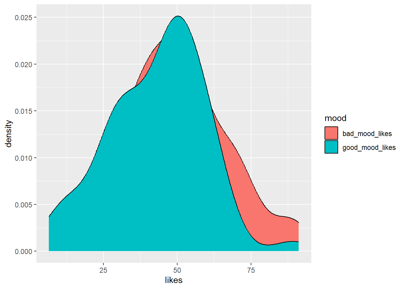
So…this is OK. But some things are left to be desired. It would be nice if good_mood_likes didn’t occlude bad_mood_likes, because we want to see how both distributions look.
Amend your code so that the density plots are semi-transparent. You can do this by adding an
alphaargument inside thegeom_density()function. You can think ofalphaas a value that tells you how transparent something should be. Setalpha = 0.5to make the plots 50% transparent.
Make your code match what you see below and run it to get the sweet results.
social_media_likes %>%
  ggplot(aes(x = likes, group = mood, fill = mood)) + # set canvas aesthetics
geom_density(alpha=0.5) # use the data to draw a density plot and make it 50% transparent![]()
Ahhh, that’s better! Then the last step, if you are striving for data viz beauty, is to add the classic theme (or another, if that’s your jam) to your code.
Add the
theme_classic()function to your code to give it a classic theme. Run the code to see the results.
social_media_likes %>%
ggplot(aes(x = likes, group = mood, fill = mood)) +
  geom_density(alpha=0.5) +
  theme_classic() #themes can be provided to ggplot which give it a bunch of aesthetics to change. One of these is theme_classic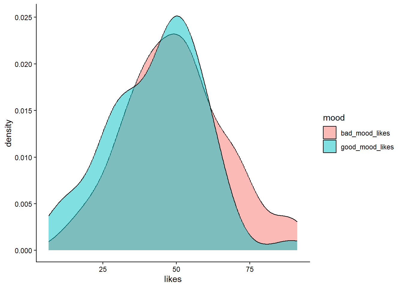
For future you: a whole world of glorious movie inspired themes await you here.
Now save your figure to your Output folder, by using the Export button on the Plots Pane.
3.4.3 Activity - So you’ve visualised your data, now what?
Great, we’ve visualised the data! So, now what? I hear you cry?
We visualised the data so we could check the following things before running our statistical test:
1. Are the distributions of likes in each mood roughly normal?
2. Are there any obvious outliers that might affect the results of our statistical test?
What do you think?
Make a comment in your code in answer to both these questions. Discuss your comments with your tutor if you are unsure.
3.5 Descriptive statistics
Before we can move onto conducting t-tests, the next step is to understand the descriptive statistics. For the data we are looking at the most relevant descriptive statistics are the mean and standard deviation. This is because we want to conduct a t-test to compare the average likes in different moods. The t-test asks if the difference between the means is larger than we would expect by chance, given the variability in the data (i.e. the standard deviation). That’s why we need to know the mean and standard deviation of likes in each mood.
tidyverse to the rescue! We can easily get this information in R by using the summarise() function. The summarise function will take a dataframe and calculate summary statistics for it, and we get to define what summary statistics we want. The power!
Because we want to know the mean and standard deviation of likes in each mood, we need to use the group_by() function to tell R to split the data by mood first.
3.5.1 Activity - get descriptive!
Amend the following code in your script so that it matches what you see below. Then run it to get the mean and standard deviation of likes in each mood.
social_media_likes %>%
  group_by(mood) %>% #split the data by mood
  summarise(mean = mean(likes),
            sd = sd(likes)) #calculate the mean number of likes
## # A tibble: 2 × 3
## mood mean sd
## <chr> <dbl> <dbl>
## 1 bad_mood_likes 49.8 17.2
## 2 good_mood_likes 43.0 16.1We can also save this as a new data frame if we want to use it later.
Amend your code so that the results are assigned to a new data frame object called
social_media_descriptives. You can use the same method as when you assigned your data frame tosocial_media_likes. Then run the code to create the new data frame.
Question: What are the mean number of likes in each different mood? What is the standard deviation? How do they compare to what you expected when you made your hypotheses? Make a note in your comments underneath your original statement of the hypotheses.
3.6 Testing hypotheses manually
Now that we have had a look at the structure and descriptive statistics of our data we can have a go at using a t-test to compare the number of likes participants made in a good and bad mood. We could of course do this manually, by hand (as we have in the statistics tutorials). We have shown this below using the first 10 values for good and bad mood likes.
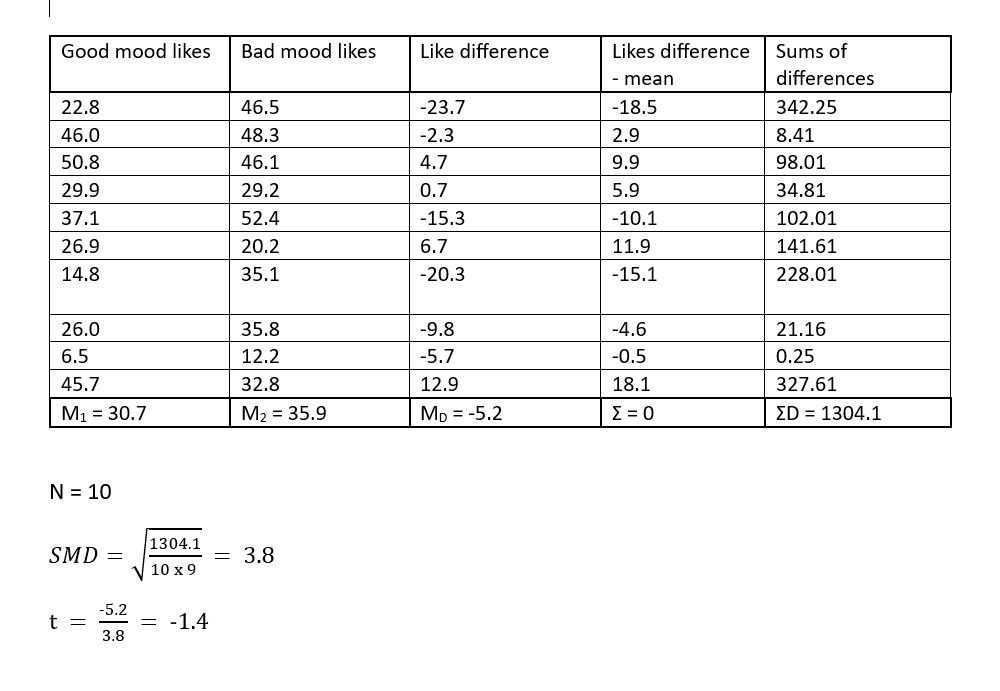
Figure 3.2: t-test table
Thankfully, we have long since past the stone (pen) age so it is no longer necessary to do this by hand. We can get computers to do this for us!
Figure 3.3: Handwritten statistiscs be like
3.7 Testing hypothesis using a paired-sample t-test
We can very easily calculate a t-test with R using the t.test() function which comes as part of baseR.
Have a look at the help for this function using the
?syntax, much as you did in Section 1.5.
We recommend you type your request for t.test help info directly into the console. You should now see some helpful information in the Help pane.
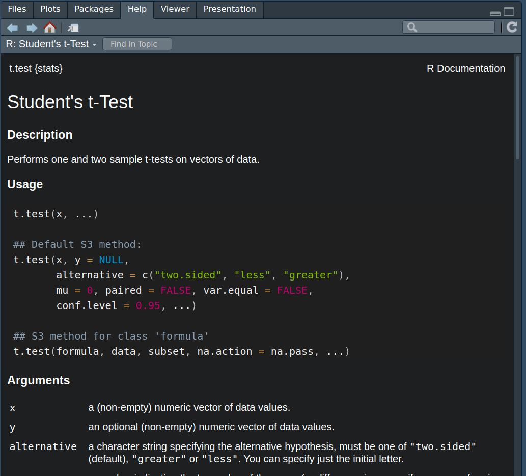
Figure 3.4: Handy t-test help
We can see that t.test() takes different arguments which are important for the way it handles the data. What values you provide to these arguments is dependent on what kind of test you want to conduct.
3.7.1 Activity - Conducting a paired t-test
We are going to go through the arguments we need to perform a paired sample t-test. We can see from the help info that we should input a set of data values to an argument called x and another set of data values to an argument called y. You can think of x and y as stand-in names for the two variables we want to compare, which are good_mood_likes and bad_mood_likes.
Now the t.test function is from base R, and now you get to meet one of the peculiarities of base R. The x and y arguments expect your data to be in wideform format –But we did all that work getting it into longform, I hear you cry– Yes, we did. But remember, that allowed us to easily compute descriptive statistics and visualise the data.
Luckily for us, we also have the original wideform data saved in the social_media dataframe. So we will use that to compute our t-test. To do that, we need to know about a magical operator in R which is $. The $ operator allows us to access the values in specific columns in a data frame. For example, if we wanted to access the good_mood_likes column in the social_media data frame, we would use social_media$good_mood_likes. This tells R to look in the social_media data frame and get the stuff that lives in the column called good_mood_likes.
Complete the line in your script so that it matches below, and then run it to see what happens.
You should see all the numbers from the good_mood_likes column, printed to the dataframe. That’s exactly what the t.test() function needs to see to do its work.
Complete the code in your script so that it matches what you see below. But don’t run it yet! There are some more things we need to tell
t.test()before we can get it to do what we want.
t.test(x=social_media$good_mood_likes, #the x argument gets the good_mood_likes data
       y=social_media$bad_mood_likes) #the y argument gets the bad_mood_likes data
Now there is one more argument that we super care about setting when performing a t test. This is the paired argument. The paired argument tells R whether the two sets of data we are comparing are dependent (e.g. from the same people) or independent (e.g. from different people). We refer to dependent observations as “paired”. Here, we know that the good and bad mood likes are from the same people, so we need to set paired = TRUE. If we were comparing likes from two different groups of people, we would set paired = FALSE.
Update the code in your script so that it exactly matches the below. Run it and check the output is the same as what we have here.
t.test(x=social_media$good_mood_likes, #the x argument gets the good_mood_likes data
       y=social_media$bad_mood_likes, #the y argument gets the bad_mood_likes data
       paired = TRUE) #tell R that the data are paired (i.e. from the same people)
##
## Paired t-test
##
## data: social_media$good_mood_likes and social_media$bad_mood_likes
## t = -3.336, df = 59, p-value = 0.001474
## alternative hypothesis: true mean difference is not equal to 0
## 95 percent confidence interval:
## -10.881375 -2.721958
## sample estimates:
## mean difference
## -6.801667Now we have some answers! Use your new found knowledge of t-tests to interpret the output. What does it tell you? Does it refute the null hypothesis? Does it support what you thought?
Write your interpretation of the result as a comment under the code you used to perform the t-test.
Find in the output the 95% confidence intervals for the mean difference. Write them as a comment in your code and your interpretation regarding the possible size of the effect, in the context of our hypothesis.
3.8 You are Free!
Well done you have finished for this week! Once you finish, please confirm with your tutor that you understand all the things.
Figure 3.5: Admit it, that was some good hypothesis work
3.9 ⭐ Bonus exercises
3.9.1 Bonus Activity - Correspondence to one-sample t-tests
If you have cracked all the activities above, well done, you are coding like a fiend. Time for bonus knowledge, if you seek it.
Now that we have the output of a paired t-test we can compare it to a one sample t-test on difference scores. The results of both of these tests should be identical (this has been covered in the lectures). For those that haven’t attended the lectures, a) attend the lectures because if not you will miss out on so much more knowledge, and b) this is because a paired t-test is basically a one-sample t-test of matched difference scores (more on that here)
Let’s conduct a one-sample t-test of the difference scores between good and bad mood likes.
Use the
mutate()function on the originalsocial_mediadataframe to create a difference score column - i.e. subtractgood_mood_likesfrombad_mood_likes(the code is below, in case you didn’t complete the bonus exercises from last lab).
You should see something that looks like the below:
social_media %>%
  mutate(likes_diff = good_mood_likes - bad_mood_likes) #create a new column which is the difference between
# good and bad mood likes
## X id age time_on_social urban good_mood_likes bad_mood_likes
## 1 1 S1 15.2 3.06 1 22.8 46.5
## 2 2 S2 16.0 2.18 1 46.0 48.3
## 3 3 S3 16.8 1.92 1 50.8 46.1
## 4 4 S4 15.6 2.61 1 29.9 29.2
## 5 5 S5 17.1 3.24 1 37.1 52.4
## 6 6 S6 15.7 2.44 1 26.9 20.2
## followers polit_informed polit_campaign polit_activism likes_diff
## 1 173.3 2.3 3.2 3.6 -23.7
## 2 144.3 1.6 2.2 2.6 -2.3
## 3 76.5 1.9 2.7 3.0 4.7
## 4 171.7 1.6 2.3 2.6 0.7
## 5 109.5 2.0 2.9 3.3 -15.3
## 6 157.5 2.4 3.4 3.9 6.7Now, we’re going to need to save that dataframe to an object called social_media_diff, so that we can use it in the
t.test() function.
Update the code you just ran so that it starts with
social_media_diff <-and run it to save the dataframe.
Now that we have correctly calculated and saved our difference score we can use the t.test() function to perform our one-sample t.test.
Copy the below line of code into your script and run it. Compare the output to the output of the paired t-test you did earlier. Are they the same?
t.test(x=social_media_diff$likes_diff) # putting in only an x argument makes this a one-sample t-test##
## One Sample t-test
##
## data: social_media_diff$likes_diff
## t = -3.336, df = 59, p-value = 0.001474
## alternative hypothesis: true mean is not equal to 0
## 95 percent confidence interval:
## -10.881375 -2.721958
## sample estimates:
## mean of x
## -6.801667Ahhhh, its so beautiful when you get consistent results!
3.9.2 Bonus Activity - visualising differences in paired data
There are lots of ways to visualise paired data. One great way is to use a spaghetti plot. A spaghetti plot shows the individual data points for each participant in both conditions, and connects them with a line. This allows us to see how each participant’s likes changed between good and bad mood. i.e. we can see how consistent the effect is - does everyone’s line go up or down, or just for some people?
Here is the basic code for a spaghetti plot:
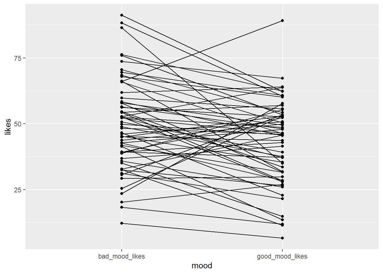
Copy the code to your script and run it. Can you write a comment in your code interpreting what each line of the code is doing?
The code above produces a very basic spaghetti plot. We can improve it by adding some aesthetics.
Can you change the code so that the points are bigger? So that the lines are a bit lighter?
Helpful hints: start by looking at the examples in the help for geom_line() and geom_point(), or ask your favourite LLM how you would adapt the above code to achieve these objectives.
How about adding a theme to make it prettier?
What else can you think of? Is there a better way to present the data? Use the R Graph Gallery for inspiration.